Screens and displays
An event memory wall of small photographs, several at a time
An event memory wall is a screen layout that sets several of the guests' photographs in one composition instead of playing one at a time. Here is what that trade buys you, and when it costs you the room.
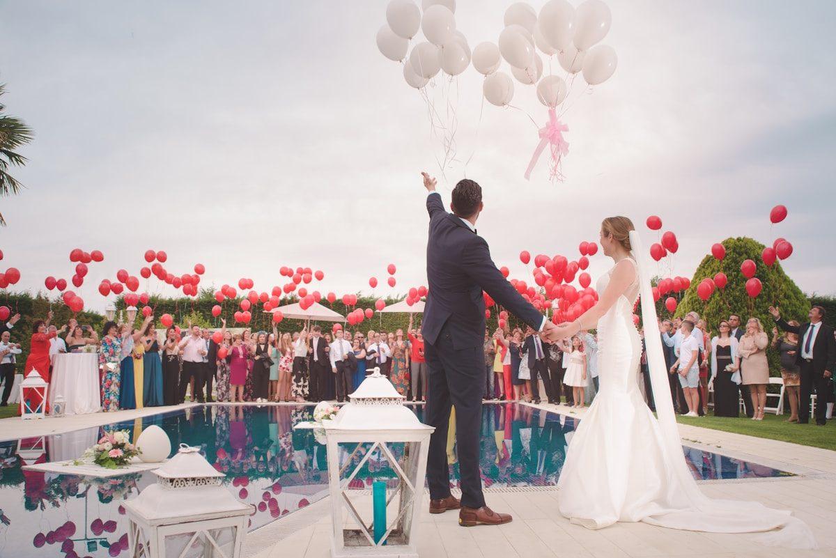
The word wall gets used for two different things, and only one of them is this. There is the physical kind: printed photographs pinned to a board at a party, which is a craft project and not a product. And there is the screen kind: a layout that puts a number of small frames on one panel at the same moment, so a room sees a collection rather than a sequence. This page is about the second one, which is the arrangement that behaves best with the material guests actually send. It is a legitimate search phrase and a legitimate thing to want, and the name of it on the picker is not Memory Wall; that is a useful piece of trivia and the next section explains why.
The name on the picker, and the name people search for
The room screen has twelve presentation styles, and the multi-frame one is called Dynamic Mosaic: a living composition of several photographs at once, arriving in a coordinated stagger, with the layouts stepping up into a single larger frame and back down again. Older saved settings under the name Memory Wall resolve to the same engine, so if you find a note you made last spring calling it a memory wall, that is the identical layout rather than a second product you have to ask about. Two other styles also put more than one picture on the screen at a time, which is where the honest comparison begins: Immersive Gallery sets diptychs and triptychs with a great deal of space around them, and Celebration in Motion runs split screens at a pace designed for a party.
- Dynamic Mosaic
- A wall. Many small photographs composed together, staggering in and out, with a hero frame in the middle of it now and then. It is the one built for volume, and it is the one that forgives uneven quality because nothing has to carry a whole screen on its own.
- Immersive Gallery
- Two or three framed plates in an exhibition of empty space. Several photographs, but treated as objects rather than as a crowd. It reads beautifully in a quiet room and reads as a slideshow with gaps in a noisy hall.
- Celebration in Motion
- Split screens and coordinated entrances at an upbeat rhythm, made for parties and milestones. It is the busiest of the three, which is the point: it is designed to compete with music rather than to be watched.
The arithmetic that makes a wall better than a sequence
A single-frame layout plays one photograph for the number of seconds you set. At six seconds a frame, a collection of two hundred photographs takes twenty minutes to pass through once, and a room of people who have already seen the third toast will not wait for the two hundredth. A multi-frame layout changes the ratio rather than the total: every hold now shows a composition of photographs rather than one of them, so the wall appears to move at the speed the collection was made at instead of the speed a projector was invented at. That is the entire argument, and it matters most in exactly the rooms where nobody is watching on purpose.
A big pile of similar photographs
Ninety guests sending two frames each of the same three moments. Repetition is not a fault in a layout designed to hold a crowd, and it is a loud one in a layout that gives each frame the whole screen.
A room that is talking
A drinks reception, a bar, a long lunch. Nobody is watching the panel, so the wall's job is to be readable in a glance from the corner of an eye. Several faces at once deliver that; a slow crossfade between two frames does not.
An occasion where the point is the number
A reunion, a school leaving year, a sports club, an office away day. What the room wants to see is everybody, and a grid of small frames is the arrangement that can show a crowd of people in the time a single photograph takes.
A collection that is still arriving
A wall holds more of a growing pile in view at once, which means a photograph sent at four is visible by half past four rather than queued twenty minutes behind everything else.
Where a memory wall loses the room
What you give up with many small frames
- A face at the size of a face: from the back of a hall, a small frame is a colour rather than a person
- The pause a single photograph forces, which is the only thing that makes a room stop talking and look
- The ceremony moment, the speech, and the one frame the whole family wants to see properly
- Any caption or name that has to be readable at the same moment as nine other frames
What you get for it
- A wall that reads as a collection rather than as a loop of the same toast
- Uneven photographs that stop being embarrassing, because nothing is being examined on its own
- More of the pile in view every minute, which is what a room that filled the collection earned
- A surface that works while people are arriving, eating and leaving rather than only when they are seated
One layout is chosen per collection and it holds for the whole event, so a wall that also has to carry the quiet moment is a decision to make before the day rather than a thing you can switch at eight o'clock.
The vertical-frame problem
Almost every photograph a guest takes is taller than it is wide, held in one hand pointed at another person. Panels are the opposite shape. A single-frame layout solves that by padding either side, which is why one good phone photograph on a wide television often looks like a postage stamp in a grey field. A multi-frame composition handles the same material far more naturally, because a grid of portrait tiles is close to the shape a wide screen actually wants when it is filled. If you are deciding between the two on the strength of nothing else, this is the deciding fact: a collection of guests' photographs is a collection of vertical frames, and a wall layout was designed for them while a single-frame layout is tolerating them.
Reading distance, and the only test that matters
Fill the collection with what you actually expect
Twenty frames taken on a phone in a dim room, not the twelve good landscape photographs from your camera roll. The wall will be judged against the material it is really going to carry.
Open the wall on the machine that will run the day
Full screen, the shuffle left as it is, the contributor names on, so the test is the arrangement rather than a preview.
Walk to the furthest seat and look at it for a minute
Can you tell who is in the frames? If not, the wall is a texture from there, and you either need longer holds, fewer frames per composition, or a second smaller screen where people are actually sitting.
Check it again with the lights as they will be
Afternoon daylight through a window is a different picture from the same panel at nine with the room dimmed, and a busy composition is the one that suffers first when contrast goes.
What a running wall does with a frame nobody wanted
A wall of small pictures is easier to tolerate than a single picture of the same quality, and that is one of its quieter advantages: nothing in the composition is exposed. The controls underneath are the ones the whole screen shares. Arriving photographs either go straight up or are looked at first, which is a switch on the collection, off by default, and the wall then plays only what the collection holds. A running screen picks up new arrivals without anybody reloading it, and drops anything taken back out. And from the machine itself, the arrow keys step the wall past a frame, space holds it, F goes full screen, and M mutes a clip.
What this page is not describing
There is no printed wall, no physical board, no framing service and no guestbook of pinned notes in this product, and the wall is not a photograph of a screen you can cast to a phone. It is one of twelve arrangements for the room display: a browser, an address, and a pile of the guests' own files.
What the room screen doesWhat a wall does to the editing you were going to do
Hosts who intend to sort a guests' collection before showing it almost never do it, because the sorting is the boring half of an event and the event is happening. A multi-frame composition lowers the price of not sorting. The near-duplicate frames, the one taken through a wine glass, the blur from the back row: in a single-frame arrangement each of those is given the whole screen and a held silence, and the room is obliged to examine it. In a wall they are part of the surface, which is the same effect a crowded noticeboard has on a mediocre photograph pinned to it. That is not a trick of presentation, and it is not a substitute for taking something out when it genuinely should not be there. It is the reason a wall is the layout that survives an unedited pile, which is the pile you are actually going to have.
The duplicates
Eleven photographs of the same moment stop being an embarrassment when several of them are visible in one composition, because the room reads them as one event seen eleven times rather than as one event shown eleven times.
The uneven quality
A collection assembled from ninety phones contains every exposure the venue ever produced. A layout that never gives one frame the whole screen means the poor photographs are never on trial.
The ordering
A sequence invites a room to notice that the good pictures came last. A wall shows a period of the day rather than a narrative, which is why the shuffle default bothers it a great deal less than it bothers a single-frame arrangement.
How the same wall reads across the hours
The first hour
Thin, and honest about it
A handful of frames from the people who arrived early. The compositions have space in them and show it, which is why a wall opened at three looks sparse and the same wall opened at six does not. Nothing has failed; the pile is simply young.
The middle of the day
Where the layout earns its place
By now the collection is full enough that the frames fill, the duplicates have arrived, and the room has stopped checking whose photograph is next. This is the stretch a single-frame arrangement survives least well and a wall enjoys most.
The moment everybody looks
The layout working against itself
A speech, a cutting, a name being read: the room wants one image at the size of the screen, and a wall cannot give it one without showing the others beside it. This is the honest cost of the arrangement, and it is why a quiet ceremony is usually better served by a style that holds a single frame.
After the room has gone
A different object entirely
Four people and a television on a Sunday afternoon. A wall of small frames is the wrong thing to watch when anybody actually wants to look, and it is the right thing to leave running while a family argues about who took the blurry one.
Choosing it at the point where you choose it
The layout is picked when the slideshow settings are filled in, alongside how long a frame holds, how the wall moves between them, whether clips are in, and whether names are shown. A preview of each arrangement is there while you choose, and it is worth a minute even though a preview of a curated set flatters everything. The decision that actually predicts the result is a different one: how many photographs you expect by the time the room sits down. Under forty, a single-frame layout is a treat. Over a hundred, the same layout is a queue with pictures in it, and the wall is what the collection has earned.
How many photographs can be on the screen at once?
It depends on the arrangement rather than on a setting, and the compositions run from a single hero frame up to a full grid of small ones. What you control is how long a composition holds, between two and thirty seconds, and how the wall moves between them.
Is a memory wall a separate product from a slideshow?
No. It is one of twelve layouts for the same room screen, chosen before the event, running from the same address as everything else. A collection does not have a wall version and a slideshow version.
Can we see who sent which photograph on a busy wall?
The screen can credit the sender beside their frame, and it is on by default, but a small caption competing with several simultaneous frames is not something a hall reads. On a wall layout it is mostly for the people standing close to the panel.
Will a wall layout play films as well as photographs?
Clips play in the collection and on the screen whatever layout you chose, held for a length you set for the room, and they arrive silent unless sound is switched on. A busy composition and a speech clip are competing for the same attention, which is the thing to decide beforehand.
Can we change the layout halfway through the event?
One arrangement applies to the whole wall, so plan for the room you will actually have rather than for both the ceremony and the dance floor. What you can do mid-event is change the pace: how long frames hold, and whether the wall shuffles.
Does this work on a projector as well as a television?
It runs from a browser, so it goes wherever a browser goes. A projector costs you contrast, which a many-frame composition survives better than a dark single photograph does, and it also makes every frame in the grid an announcement to the whole room at once.
Count the photographs you expect, then choose the layout
A hundred frames from a room of guests is not a slideshow of single pictures held for six seconds each. Open a collection, name the occasion, pick the wall, and put the code where the phones are.
Slideshows and room displays
Put one link on the tables and let everyone contribute.
Create a collection, print the table stands, and the photographs your guests took are waiting for you the morning after. Guests never install anything and never make an account.